Brand Strategy & Professional Logo Design Service based in Leicester, UK.
Mountain High Consultants
Logo design for an aviation consultancy

The Mission
The company was established in 2003; MHC is a privately owned crew solutions and aviation consultancy company. Their fields of specialty are Recruitment, Contracting and Payroll Support, HR and Training Administration, and Aviation Insurance arrangements.
The task was to craft the Mountain High logo design that is simple yet unique mark what makes them different from their competitors. It was also important that the design appeals to clients who want to have quality service.
The Output
I have worked together closely with the client on this project. A brand discovery session helped a lot to understand the business and its needs. We agreed on redesigning the original mark what was outdated and didn’t identify the business well. I have created a collection of social media graphics, a series of icons for the brochure design.
The Impact
After rebranding the company’s original logo design the Mountain High Consultant brand has a solid foundation to build on their identity system. The new logo is differentiating the business from the competition and now it is reflecting a professional service.
Client
Mountain High Consultants
Services
Logo Design
Flyer Design
Brochure Design
Icon Design


Squeeze an aircraft into the symbol.
Mountain high consultants Logo Design
The company has approached me with a need to renew their old logo. They wanted to have something simple yet unique mark what makes them different from their competitors. It was also important that the design appeals to clients who want to have quality service. As they are working aviation industry, some part of the aircraft was a must include an element in the logo design. They also requested an online and a printable tri-fold brochure.
The Challenge
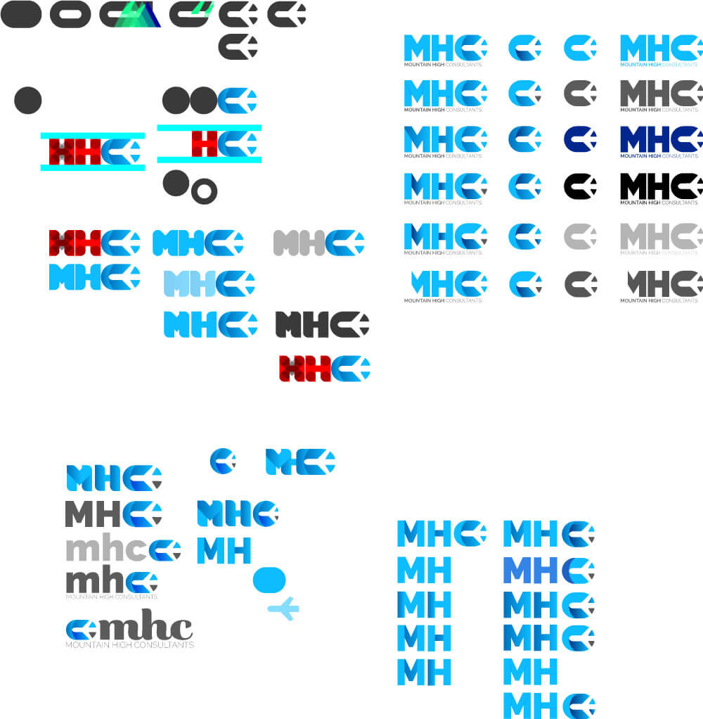
The biggest challenge for me during this project was the fact that the clients wanted to incorporate some part of an aircraft. I worked on this logo design and explored various routes during the design process. However, the strongest direction came when drawing an oval type concept with a plane shape in it. I found that this simplified aircraft design will work well with the oval shape and the two elements will form the “C” letter in the MHC mark. I have discussed this idea with the client who was going down on this route. Also, the “C” letter can be used as an individual mark for the company. This variation of the logo can be recognizable for further clients. To push the idea further, I created a custom type for the main design element.
To compliment the bold logo type, I used a thin, serif typeface that has added fresh feel to it. Whilst it is simple and looking professional, the characteristics of the typeface also allow it to feel serious.
Nature of the style of the logo I have used only two colour for the logo. Because I used blue as the main and grey as the secondary colour, this variation gives some dept to the logo design.
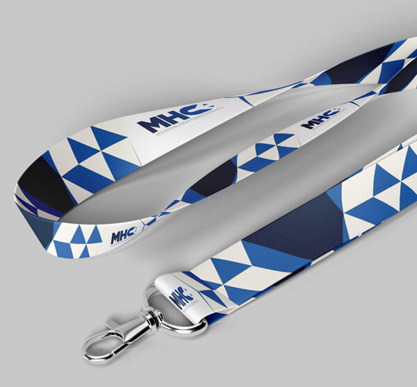
The final solution is a stylised and contemporary logo design. It will work well on any online platform and printed materials.


Color & Material
Finally, we settled at a dark to a light blue gradient. However, it was very important that the design is working in a monochrome version as they will use the logo on different platforms and materials.


