Fly Ux
Digital Product Design
Fly UX is a flight booking web application designed to remove the complexity and pain when booking a flight . This case study is the outcome of the Professional Diploma in UX Design course from The UX Design Institute.
THE GOAL
To create an online flight booking experience that is simple, accessible, and based on a deep understanding of their end users.
ROLE
User Research and Experience Design.
TASKS AND DELIVERABLES
User Research (usability testing, interviews, competitor analysis, survey)
Customer Journey Map
User Flows
Navigation Style
Interaction Design
Interactive Prototype
Wireframes

Research
Defining the problem
Competitive Benchmark
I started this project by doing a competitive analysis of 4 websites that is using a booking system – 3 direct competitors, and 1 indirect competitor.
The benchmark focused on the following aspects of the booking process:
• Homepage. How easy is to find the main flight search bar? How clear are finding the next steps?
• Search and Select. Where is the search bar located? How does the date picker work, and what date format does it use? Is the CTA visible? How easy is to select a flight fare? How can be an extra or unusual luggage can be added? How is seat selector working?
• Entering details and Payment process. How do customers enter details, what are the payment methods? Is there an option to go back and make changes? Is the booking summary visible?
The outcome helped me to understand the industry conventions, highlight what our competitors are doing right and find the areas of improvement.


Research
Usability tests & Survey
To create the best flight booking experience usability test was an absolute must. I decided to process with usability test and an in-depth interview.
• 2 usability tests on two different airline website.
• 1 in-depth interview
I conducted and moderated both the usability tests and the interview. During the sessions. I take the chance of taking notes and observing the sessions.
Ahead of the usability test session, I needed to define my research objective to narrow my focus.
Usability test objectives:
– Identify user behaviours on Wizzair and Ryanair websites.
– Find out which sections working well during a booking process
– Find sections what could be improved during the booking process
- What are the overall feelings about the website?
Once having my research objective, I have prepared a test script to keep the session on track and steer it back in the right direction if needed. It was key to maintain the interview conversationally without making the user feel like being interrogated.
During the session, I asked the user to complete one task: to book a flight to Budapest with a specific requirement such as add ‘baby equipment’ or ‘music instrument” on two airline websites taken from the benchmark analysis.
The way they progressed through the booking process was really eye-opening for me. There were steps that they struggled with or simply didn’t find how to go to the next step. They didn’t find features that they looking for or accidentally added extras that they never wanted without knowing it.
In the mean time I was created an online survey what I used for learning more about how people are using airline website to book their trips.


Analysis
Finding patterns
Affinity Diagram & User Journey Map
After gathering all data and observations from the research, I needed to structure all the information, so I used a whiteboard to create an Affinity Diagram. This step give me the opportunity to find the patterns and group them to use the gathered information in a structured way.
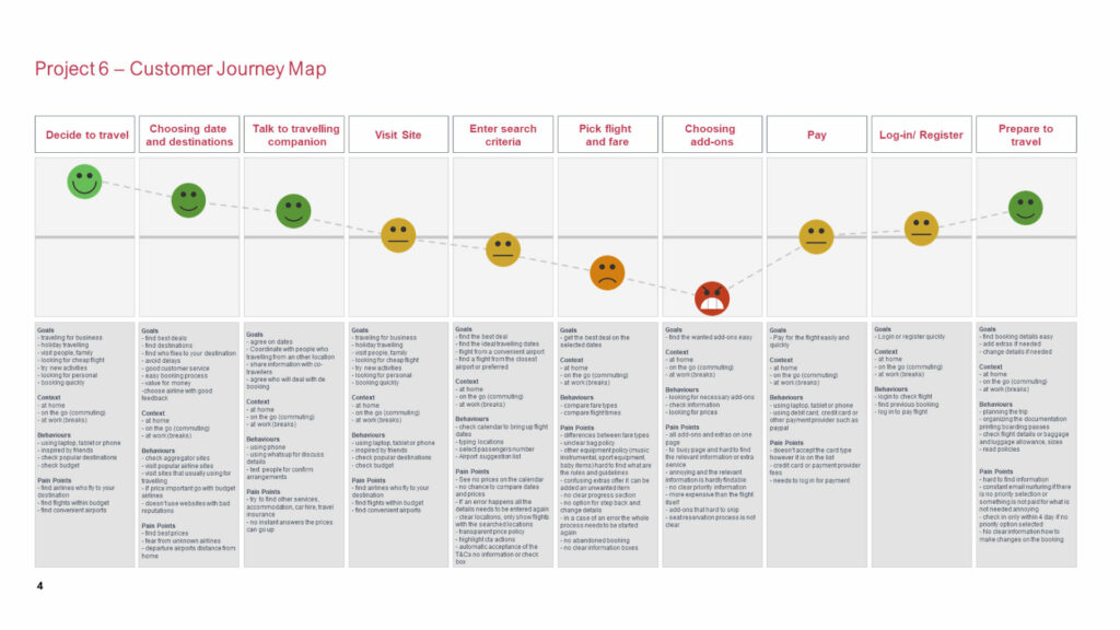
After finding the patterns, I needed to understand how the users interact with the website when booking a flight. To do that, I created a Customer Journey Map.
The goal was to map the user’s journey from the homepage to the payment page, ready to complete the booking process. It was crucial to document every step along the way. The more understanding of the context, the better the solution!
The steps were as follows:
• Decide to travel
• Choosing date and destination
• Talk to a travelling companion
• Visit site
• Enter search criteria
• Select flight and fare
• Choosing add-ons
• Pay
• Log In \ Register
• Prepare to travel


Define
Defining the solution
User Flow & Define Navigation Style
I started with sketches of the user’s flow to think through the solutions in creating a smooth and minimal friction experience.
I defined a high-level flow for the desktop website, focusing on one primary use case, from the homepage to the payment page in the flight booking process.
Mapping out the interactions gave me a better understanding how the user will move through the booking process.
As a next step I have created the desktop navigation style to have a clear grasp how the flow will work.


Design
Defining the solution
Interaction Design
I have sketched out the possible solutions for each screen based on the gathered information from the customer journey map and user flow and used the navigation system as a guide. Using pen and paper helped me to exploring ideas. This way I could iterate the created design options quickly.
My first solution for the date selector was a single-month display with arrows for selecting the previous or next month. After iterating the screens and going back to the research phase, I realized it would not help the seamless experience and might cause friction with the user.


Prototype
Medium fidelity prototype
Prototyping
The next step was to create a prototype, I have used Figma for this project. I enjoyed creating a solution that includes more detail and interactivity.
This prototype could then be fed back into a validation phase and iterated over time for further improvements. At this point I have gone with the medium fidelity prototype, as a designer I didn’t want to have the temptation to work on the visual elements rather than the solution.


Wireframe
The handover
Wireframing
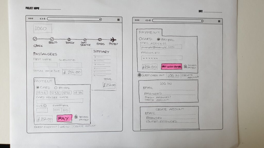
After completing the previous steps I progressed further and created the documentation for this project that included all the information for development. I created detailed wireframes, including the rules, controls, and feedback of every screen and screen state on the flight booking process for the developers to build the application.


Conclusion
My learnings
This project was part of the UX Design Professional Diploma, there were no real metrics to show, instead, I will share my learnings.
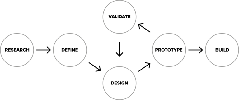
• Following the process is important! User Experience Design is problem solving discipline. A great website or app solves users problems while generates positive emotions.
• The devil’s in the details! Understanding the way how the user interacting with a product gives huge amount of information. If you are focusing on the details, you will find golden nuggets that will help you create an amazing product.
My biggest challenge was conducting and moderating an usability test for the first time. I got a little nervous that I would do it wrong.
I enjoyed creating the interaction design using all the information that was gathered during the project. Understanding and designing the structure and how the user moves through the process was very insightful, learning how to and when to add or remove unnecessary blocks and make it as smooth as possible. I also gain plenty of knowledge in understanding the different screen states and how these matters more than the actual screens themselves.
This project made an enormous impact on my view on UX. I have gained a deeper understanding of the UX process and the different research and analysis methods that armed me for future projects or collaborations.
Based in Oakham, UK
I love excellent books, the Tampa Bay Buccaneers, Toronto Blue Jays and Seattle Kraken
Working with amazing clients big & small, near & far
